Impact OS
Make more visible.
Impact OS is the safest bold step: it keeps the current Farmerline identity recognizable, then fuses Mergdata into the first screen as the operating layer behind training, finance, measurement and market access.
01
Strategic Role
The current company site and the product site feel like separate organizations. Impact OS resolves that by making Farmerline the trusted parent and Mergdata the visible technology layer inside the same story.
Keep the brand guide's direct language: make more food, make more money, make more impact. The homepage should not start with a product menu or a generic corporate claim.
Mergdata appears on the first screen as the intelligence system that makes Farmerline's field work measurable, finance-ready and partner-ready.
Counters, mapped acres, partner cards and product zones should feel like live evidence, not static marketing statistics.
02
Brand Architecture
This direction treats Farmerline as the umbrella brand and Mergdata as the product platform inside it. The user should never have to choose between two websites to understand the company.
Parent Story
Farmerline is the company that enables farmers and partners to grow wealth, increase food production and measure outcomes. It owns the human mission, the partner trust and the field network.
Navigation language: Mission, Teach / Finance / Measure, Mergdata, Proof, Partner.
Product Story
Mergdata is positioned as the platform that connects Terra, Darli, Collect, Grow and Open Finance into a single operating layer for agriculture programs.
Product language: know every acre, hear every farmer, profile every field, unlock capital, move commodities.
03
Colour System
The palette merges Farmerline's turquoise and amber with Mergdata's black and acid yellow. The result is familiar, but more digital, assertive and platform-like.
Farmerline Turquoise#00C9BA
Farmerline Amber#FFA000
Mergdata Acid#FFF800
Mergdata Black#0A0A0A
Warm Grey#EBEAE5
Signal Blue#289BFF
Turquoise as the trust and field-network color. Yellow/amber should be reserved for action, live data and Mergdata emphasis.
Do not flood full pages with one hue. The CEO needs to feel a bigger company system, not a turquoise brochure.
04
Typography
The typographic hierarchy follows the brand guide but lets Mergdata add a sharper product accent.
Make more. Measure more.
Hero headlines use Archivo Condensed / Archivo Black energy: compressed, heavy, direct and unmistakably Farmerline.
Use for mission-scale language and strong proof statements.
Use for paragraphs, navigation, forms and explanatory copy.
Use sparingly for Mergdata cards, product tags, metrics and system labels.
05
Layout System
The page should feel like a guided operating system, not a landing page. Each band has a job: promise, path, platform, proof, partnership.
Hero
Mission language, real farm image, immediate Mergdata signal, live proof cards.
Path
Teach, finance, measure and trade become the core explanation of the business.
Platform
Mergdata products are shown as one stack rather than isolated SaaS pages.
Partner
The final action is not "contact us"; it is "build a measurable agriculture program."
06
Motion and Interface Behavior
Motion should make the company feel active in the field. It should clarify scale, not decorate the page.
Slow radar movement suggests acreage, field visits and network coverage.
Animate numbers once as the user reaches them. Keep the final value readable.
Hover states should explain how each step connects to Mergdata.
Buttons use the Mergdata yellow and Farmerline amber blend for urgency.
07
Imagery and Graphic System
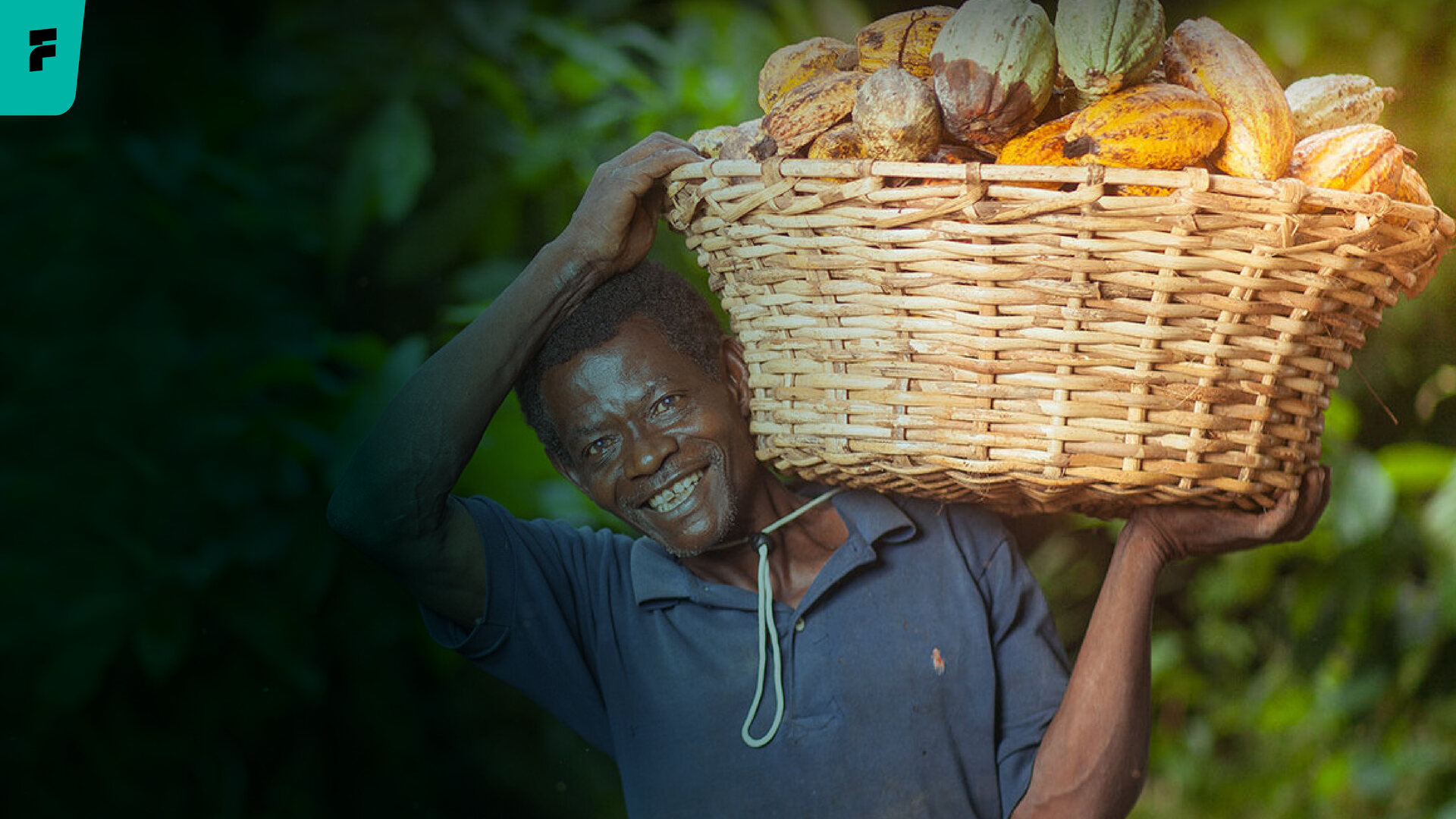
Use real agriculture imagery with product intelligence overlaid. The human story remains visible, while the technology layer is finally impossible to miss.
People first
Start with farmers and field teams, not abstract dashboards.

Data second
Use maps, radar, cards and labels to show the intelligence layer.
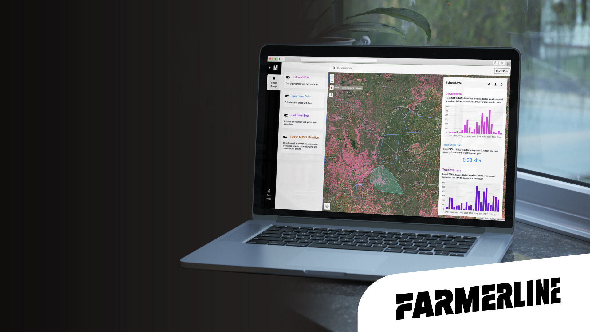
Platform proof
Mergdata appears as the operational system behind Farmerline's work.
08
Audience Journeys
The concept must work for non-technical decision makers while still giving product teams a credible place to show technology depth.
Sees the scale story in seconds: farmers reached, acres mapped, partner network and global ambition.
Understands how Farmerline can teach, finance, measure and report on a field program.
Can move from the company promise into Mergdata modules without changing brands or websites.
09
Production Guardrails
This is the recommended production candidate if the team wants ambition without discarding the existing brand equity.
Keep the current logo, heavy Farmerline headline voice, turquoise identity and real farmer photography. Introduce Mergdata through product zones and live proof, not a separate microsite.
Turn the homepage into a product dashboard. The CEO wanted better storytelling, so the first impression must stay human, bold and strategic.
CEO line: Farmerline is the mission. Mergdata is how the mission scales.